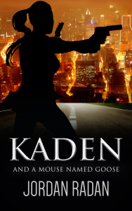
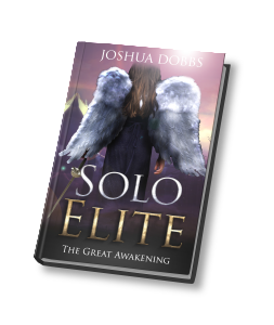
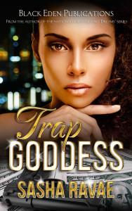
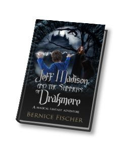
Cover Artist - 4

Continuing in art with Cover Artist - 4 by Joshua Jadon. Joshua states, "I am a passionate Graphic Designer that focuses on delivering professional work to my clients all over the globe. I started drawing at the age of 6 years old which later evolved into designing graphics." Joshua's website is located here: JoshuaJadon.com

kaden-finalSoloElite-Rendering2trapgoddess-ebook-coverrendering1


facebooktwittergoogle_pluspinterestlinkedinrss

SO, YOU WANT TO BLOG 2

SO, YOU WANT TO BLOG 2 is a summary from WordPress and Blogging Basics by Giselle Aguiar (AZSocialMediaWiz.com)

WHAT TO BLOG ABOUT: I've been asked several times what to blog about. As you know, this is an informational blog for writers and authors. What is your blog about?

Courtesy of AboutDo
Courtesy of AboutDo
  • TRENDS
  • INTERVIEWS
  • SUCCESS STORIES
  • QUESTIONS (each one you've been asked can be a BLOG post.
  • Hypothetical Situations
  • Lists EX: 10 ways to find a Title
  • Educational
  • Inspiring

To name a few.

Always remember to obtain permissions for Media you place in your blog.

QUOTES: Consider highlighting quotes and/or putting them in italics. 

BLOGGING TIPS:

  • Write Quality Content ~ Don't plagiarize!
  • Give them what they want like solutions to their problems.
  • Keep it simple.

Between 300 and 400 words, if possible.

ALWAYS PREVIEW YOUR POSTS!


facebooktwittergoogle_pluspinterestlinkedinrss

Don't Jeopardize Your Work - Making your book easy on the eyes.

This is a summary of an article by Smith Publicity with their generous permission. The original article can be found at http://alturl.com/kg5hd.

You've accomplished all that work to get a book written. Now, you Don't Jeopardize Your Work, making basic mistakes by not conforming to generally-accepted practice. One standard I'm asked about at times is the best font to use. You want a font that is: easy to read over a long passage!

There are five that, not only look good,but are often used. NOTE: THE FONTS BELOW ARE Examples by Adobe:

GARAMOND: Named after the 16th-century French "punch-cutter" or type designer Claude Garamond.


250


JANSON:

250  
BEMBO: Designed by Francesco Griffo in the late15th and early 16th century. (Hey, I didn't name it!)

 250

CASION: It was one of the most used type faces in the late 18th and 19th centuries designed by William Casion.

250

ELECTRA: Designed in 1935 by D. W. Dwiggins, Electra adds a distinctive "color" and evenness to the printed page.

250

My novels use Garamond and I'm, obviously, pleased with it as a font. Look around; there are certainly many more to chose from, but you want a font that will not tire your eyes--or your brain--while reading a long passage.


facebooktwittergoogle_pluspinterestlinkedinrss